The CraftED Community extends a warm welcome to our guest blogger, Will Fanguy of Piktochart!
When I was a teacher, I survived by following the Unspoken Rule: beg, borrow, steal. There’s only so much time in the day, and most of mine was taken up by meetings, professional development, grading papers, and… well… teaching. Taking the time to make original, engaging content was out of the question.
I took to the internet (much like you’re doing now) in search of the “best, most engaging” ways to teach subject-verb agreement or the different types of writing. More often than not, I came up either empty-handed or sorely disappointed.
I wish I had known how easy it is to use a tool like Piktochart to create visuals to go along with my lectures and slide decks. I would have spent what little time I had making awesome presentations and infographics of my own instead of wandering aimlessly around the internet.
There’s still the hurdle of taking a template like the ones we have (and we have almost 500 of them) and making it work for you. The good news is that with some imagination and a bit of dedicated effort, you can turn something good into something great. The best part is your kids will know you made it. Maybe now they’ll stop giving you a hard time about stealing someone else’s Powerpoint.
Where to Start
We’ve all seen the statistics. Students learn more and retain information longer if there are visuals associated with the material. Common Core has a visual literacy component. Using visuals in teaching is here to stay.
Research has shown that people remember 20% of what they hear, 30% of what they see, and 50% of what they both see and hear. If you’ve worked with students for long enough, you know that those numbers are a bit more hopeful than realistic. Attention spans are getting shorter by the day (thanks, Snapchat!), so capturing your students’ focus is paramount as well.
But short of being handed a list of tools and being told to use them, teachers are often left to their own devices when it comes to adding visuals to their classroom routines. If you’re like me, you know that incorporating something new is often easier said than done. Just because it’s a good idea doesn’t make it simple to integrate it into your curriculum.
Tips for Creating Engaging Classroom Infographics
Here are some tips for what I would do (as a former teacher and current advocate for visual storytelling) if I were in your shoes.
Tip #1: Keep it simple.
(Difficulty level: Easy)
If you’re looking for a low-effort, relatively easy way to start using more visuals in your teaching, start with this. We have templates that can be used as they are (with no changes necessary) to help you get your point across.
How many times have you heard the maxim “Keep it simple”? There’s no need to make it any more difficult than it already is.
Jumping right into a blank canvas can be intimidating. What do you put where? Should you be using icons or charts? Images are a good idea, but images on images? Isn’t that complicated? And can I really use an infographic to teach something more than data-based material?
Slow down, new friend. It’s ok. We’re going to start off simple, remember?
For instance, our Timeline template is great for… timelines! Without changing the existing template too much at all, you can have an easy-to-read timeline for the history of the United States.
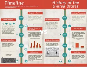 Truth be told, it took me longer to look up the information for the infographic than it did to change it up (I taught English, not US history).
My point is that it doesn’t take much effort to create something great. You can go from the placeholder text in the template to an infographic that is far more engaging and memorable in less time than it takes to grade a stack of papers.
On top of that, this template can be easily modified to show processes like diagramming a sentence or order of operations. Just change up the text and take out the charts. BOOM. That’s an engaging and memorable visual aid.
Tip #2: Remix what you know.
(Difficulty level: Medium)
The next level is to take what you (and your students) already know and turn it up to 11. If there’s a skill you’ve taught that didn’t catch on as well as you’d hoped, making a visual to go along with the review is a sure fire way to catch some of the attention you might have missed the first time around. 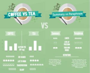
For this infographic, I took two skills that my students were notorious for mixing up: summarizing and paraphrasing. I made a comparison chart using the free Coffee vs Tea template because I wanted to add some images and icons while mixing up the layout a bit.
I’m all for Venn diagrams and T-charts, but there’s something about book icons that adds a little more interest to the review process.
This template is great for comparing two different skills or processes with similar characteristics. Choosing and arranging the icons takes the longest, but there are so many options that you’re likely to run out of reasons to use them before you run out of choices.
Tip #3: Take what you know & throw it away.
(Difficulty level: Medium +)
Please note our difficulty level here is not hard. Nothing should be hard; if it was, you wouldn’t do it. I know that, and you know that.
This is a little more complex, though. It takes a leap of faith. I want you to take what you know and the way you’ve been teaching a particular skill and just throw it away.
I know. This is dramatic. It turns what you’ve done for the past few years (or few decades, depending on how long you’ve been doing this) and turns it on its head.
But maybe it’s time to try something different. Pick a topic that you’ve taught with varying degrees of success and try something new. If you’d typically use a lecture and the occasional slide deck to teach something, take a little more time to make a visual to go along with your tried-and-true instructional methods.
Pass it out before you start teaching and refer back to it. See your students’ eyes light up with understanding and comprehension. Accept your Teacher of the Year award. Leave me your thanks in the comments. 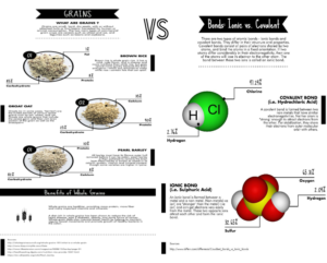
The changes here were more significant than with the last two templates. I started with the Grains template because I liked the percentages and diagramming. Images were removed and changed. We added a text block or two.
But now it looks more like a page out of a textbook. There are engaging images to go along with the text, and there’s white space in between for taking notes. If you wanted, you could even leave those percentage and element labels as blanks for an additional review opportunity. Two birds, one visually engaging stone.
Easy Does It
That’s all there is to it. You don’t have to fear the blank page (or blank template) anymore. You can pick one of these three templates (or any of the many others), make a few changes here and there, and then you’re off and running with a quick and easy way to capture and keep your students’ attention.
A note about the author:
Will is the Piktochart Blog Editor. He is a huge nerd , fancies himself a GIF connoisseur, and is pro- Oxford comma. He is also a recovering educator, having spent part of his life teaching English to middle school students. Surprisingly, he still has most of his hair.